Logo Overview
Our NEVHC logos are the most visible representation of our brand identity. This section will guide you through the proper selection and consistent usage of our logos.

Master Logo
Our master logo is the standard logo for all medical, administrative and formal units and should be the first option for logo usage.

Secondary Logos
Stacked logo: In some contexts, due to space restrictions and design, the stacked logo is the best design option.
NEVHC Shield:
The NEVHC Shield has restricted use and is not available for download. To request permission, email marketing.nevhc@gmail.com
.
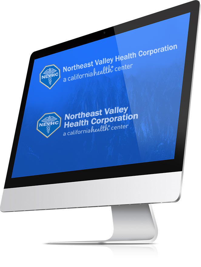
Logo Overview
Logo Colors
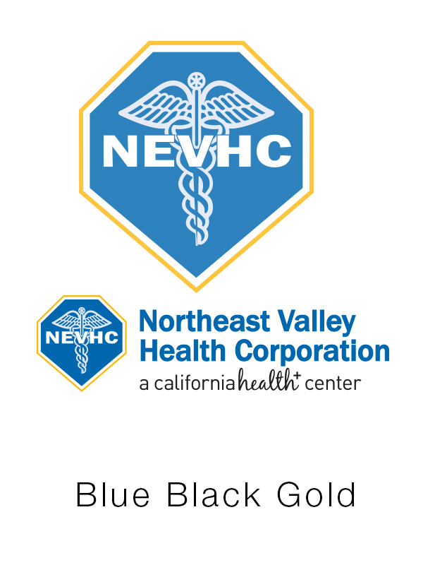
NEVHC logos can only appear in the following colors:
- “NEHVC Blue” with a “NEVHC Gold” outline for the outermost shield
- Plain White
- Solid Black
Placement
- Choose the minimum size or larger, and provide at least the minimum clear space around the logo.
- On booklets, brochures and reports the standard logo placement is in the front or back of covers. On flyers and ads the logo should appear on the top left or bottom right corner of the design.
- The logo does not need to be the focal point of a layout but the logo does need prominent placement and proportional size.
Minimum Clear Space
Do not crowd the logo. All logos must have a minimum of ¼ ” of clear space.

Logo Color Usage
NEVHC logos can only appear in the following colors:
“NEHVC Blue” with a “NEVHC Gold” outline for the outermost shield
Plain White
Solid Black
BLUE TEXT
BLACK TEXT

WHITE TEXT
DO’S AND DON’TS
Placement
- Choose the minimum size or larger, and provide at least the minimum clear space around the logo.
- On booklets, brochures and reports the standard logo placement is in the front or back of covers. On flyers and ads the logo should appear on the top left or bottom right corner of the design.
- The logo does not need to be the focal point of a layout but the logo does need prominent placement and proportional size.
Minimum Clear Space
Do not crowd the logo. All logos must have a minimum of ¼ ” of clear space.
DO NOT
- Do not alter the color of the logo
- Do not rotate the logo
- Do not superimpose a non-transparent logo on any colored background
- Do not distort the logo. The logo should never be squeezed nor stretched to fit a space.
DOWNLOADS
Select button to download a PDF of the following logos:

MASTER LOGO
PRIMARY NEVHC LOGO
SECONDARY LOGO
NEVHC STACKED LOGO
REVERSED
NEVHC LOGO


